
I wanted to take a moment today and reflect. I sat down today, wondering what I would write about. As I brainstormed, it occurred to me that opening my mind to take these data analytics courses also encouraged me to use data to drive my decisions more frequently in my day to day life. I started tracking more things in spreadsheets. I built a monthly finance spreadsheet integrating some simple formulas to instead of using a whiteboard. When I had trouble tracking my pay due to the way my freelance job site doesn't pay out neatly on a Sunday-to-Saturday schedule, I made a tracking spreadsheet for that, to ensure my budget stayed up to date. I built a spreadsheet with dropdown boxes, conditional formatting, and charts to track my job search. I never used to be aware of the data I could generate in my daily life. I never used to have the tools to capture, organize, and utilize it to make better decisions. Whether or not I ever take a position as a data analyst, I learned something that has expanded my horizons and improved my daily life. And that lesson is worthwhile, in and of itself.
8/24/2024
Today is Picture Day!
Because a picture is worth a thousand datapoints!
I made these on Tableau while working through course guides for exploring Lightening Strike data. Also hosted on my Tableau Profile!
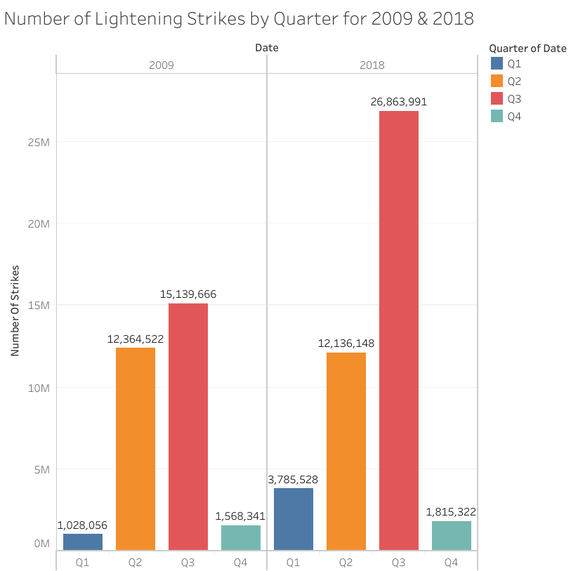
Bar Chart
This bar chart depicts the Number of Lightening Strikes divided by Quarter and then separated by Year. The two years shown are 2009 and 2018. The top of each bar is labeled with the actual Strike count for that quarter.
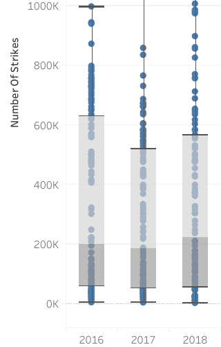
Box Plots
These Box Plots show the spread and skew of lightening strike data within quartiles, separated by year.
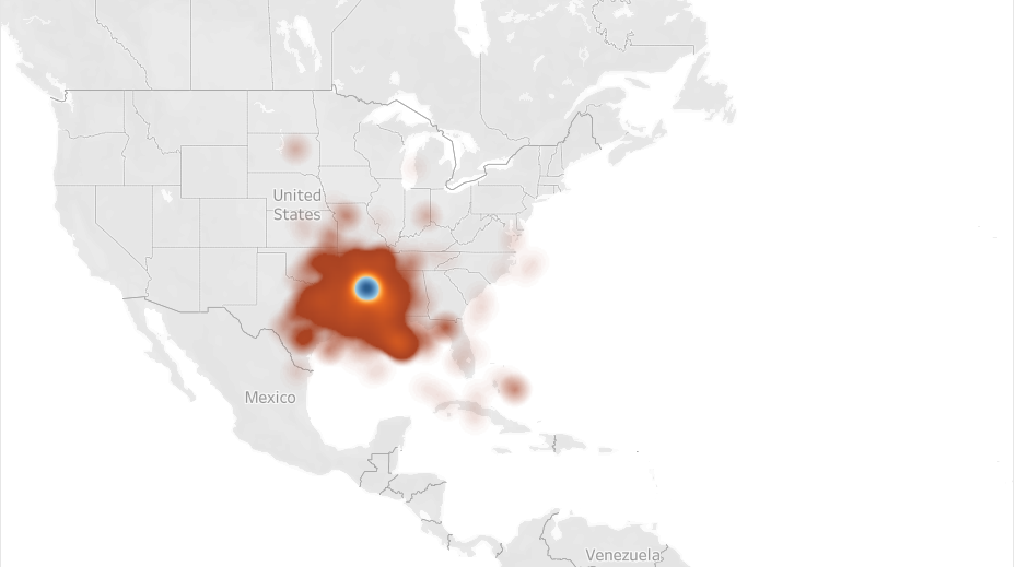
Geo Map
This Geo Map shows the concentration of Lightening Strikes mapped by Latitude and Longitude.
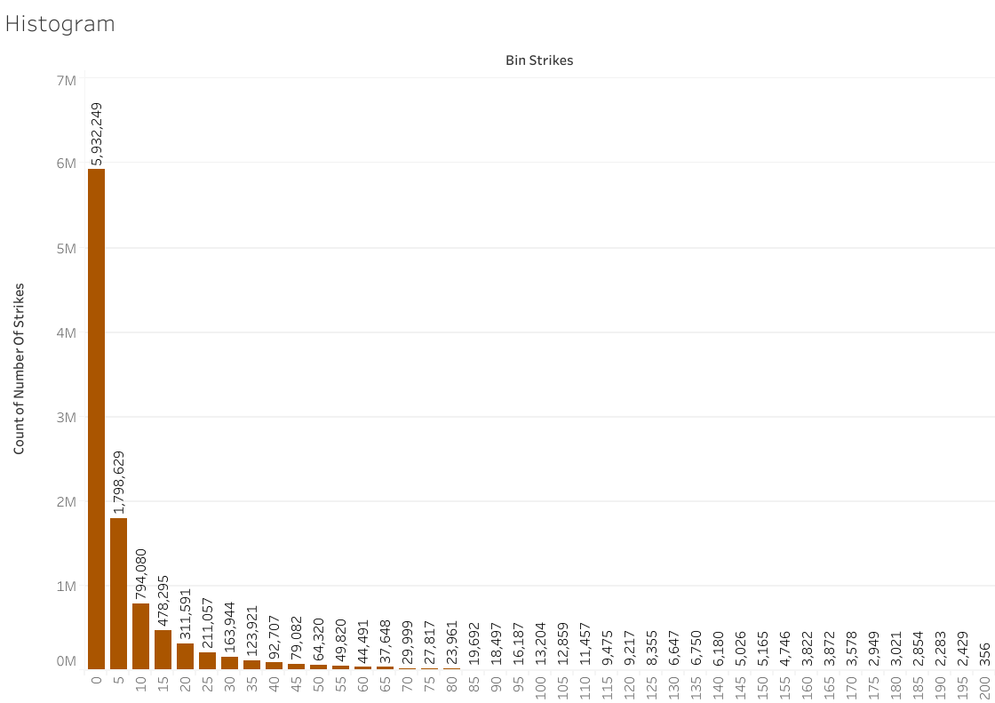
This Histogram shows the distribution of Lightening Strike data.
This Heat Map uses color saturation to indicate the Months by Year with the most Lightening Strikes.

Exploratory Data Analysis (EDA)
7/20/2024
After getting superficially acquainted with your data, it's obvious that you need to start finding the story that your data holds. Typically, data analysts call this stage of the process EDA or Exploratory Data Analysis. There are six steps in EDA:
- Discovering: Familiarize yourself with the data; start conceptualizing how to use it.
- Structuring: Take raw data and organize or transform it to be more easily visualized, explained, or modeled.
- Cleaning: Remove errors that may distort your data or make it less useful.
- Joining: Augment or adjust data by adding values from other datasets.
- Validating: Verify that the data is consistent and high quality.
- Presenting: Make your cleaned dataset or data visualizations available to others for analysis or further modeling.
The interesting thing about the six EDA steps is that they are iterative and non-sequential, meaning that during the course of exploring your data, you may perform each step more than once, and you likely won't follow these steps in any specific order. The order is specified by the needs of the project and the dataset. Some projects won't involve joining with another dataset. Others may involve doing so more than once, as well as cleaning and validating the unified dataset each time.
Structuring
Let's further examine the structuring step by looking at 5 Structuring Methods described in my analytics course.
Sorting:
- process of arranging data into a meaningful order.
- Arranging data in ascending or descending order can yield many insights including identifying high or low performers, as well as potential outliers.
Extracting:
- Process of retrieving data from a dataset or source for further processing.
- Extracting makes it easier to focus your data exploration along specific parameters, like a particular year, that allows for the most useful analysis.
Filtering:
- Process of selecting a smaller part of your dataset based on specific parameters and using it for viewing or analysis.
- Filtering lets you examine and visualize particular aspects in turn without changing your dataset.
Grouping:
- Aggregating individual observations of a variable into groups (AKA Bucketizing).
- Grouping makes it possible to examine and compare useful calculations for different categories of values.
Merging:
- Combine 2 different data frames along a specified starting column.
- Merging allows for the effective, organized combination of datasets.
It's clear that learning to use these methods effectively, especially in a particular coding language like Python, will greatly enhance the detail and effectiveness of any search for meaning in data.


Left turn at 'Python'
All Aboard!
7/13/2024
This past week my adventure took another turn when I started learning Python in my advanced analytics course. From what I read about it, Python was created to be more user-friendly than earlier programming languages, so I was excited to start. The first few lessons were great: how to use Jupyter Notebooks, object-oriented programming, basic data types and data conversions, clean code, functions, and operators. Most things made perfect analogous sense after working with either SQL or r. But then we got to conditional statements and loops. And suddenly, things weren't making as much sense.
Part of that is simply learning to think more logically. To stop and structure ideas step by step before attempting to move forward. It is a work in progress. But that wasn't all. As I sat there stumped trying to complete programming exercises, I stopped to really think about why I was having so much trouble. And I realized something about the language itself that may have been tripping me up. Python was created to be more user-friendly, to be more like a human language and less like a computer one. When I learned the basics of SQL and r, every word was specifically meaningful. It was a function name, an operator name, an assigned variable, etc. There are no 'just words' when you code in those languages. At least as far as I've seen.
Coding in Python was a surprise because sometimes there are 'just words'. I remember the first time I got completely stumped. I had to get the answer and go back to work through it so I could understand. But when I did, all I could think was "Well, I'd have figured it out if I knew that I could just throw random words in there!". For example:
def purchases_100 (sales):
count = 0
for customer in sales:
customer_total = 0
for purchase in customer:
customer_total += purchase
if customer_total >= 100:
count += 1
return count
This lovely bit of code defines a function that we are calling 'purchases_100' that takes an argument 'sales'. It calculates the number of customers who have made purchases over $100 from the list of sales by customer. So you enter the variable name for your sales list and out pops the desired number of customers. The reason this was so confusing for me initially is because 'customer' and 'purchase' are just words. There is no table with these column names. No variable list of elements is actually assigned to these words. For example, here is the tiny list of sales used in the exercise:
sales = [[2.75], [50.0, 50.0], [150.46, 200.12, 111.30]]
Each of the internal brackets represents a single customer's activity, and each of the numbers separated by commas inside that bracket represents the individual purchases made by that customer. So the way the function definition is written makes perfect sense, but it doesn't have to be written that way. Nothing in the little list of sales data says that certain information is labeled 'customer' and other information is labeled 'purchase'. I could as easily write this:
def purchases_100 (sales):
count = 0
for x in sales:
x_total = 0
for y in x:
x_total += y
if x_total >= 100:
count += 1
return count
And the function works the same way. Now, the first way is how it should be written in best practice because it makes clear exactly what the function does in a way that others can easily understand. Also, you can come back to it later and not be confused by it if you've forgotten what x and y were meant to signify. But the point is that Python lets you have that flexibility. But with that flexibility, it also grants you the option to be unclear. It is truly more like a human language. I think that is why it's almost harder for me to learn. Just like a non-English speaker rolling their eyes at the constant exceptions to the rules and pronunciation, the relative flexibility of verbiage in Python compared to SQL or r, has me floundering a little.
Ultimately, I can see how the tradeoff is worth it. Python is a powerful programming tool that allows for human flexibility while still communicating in clear ways that computers can understand. I just need to remember to think outside the box a little as I continue my Python journey!
Imposter Syndrome
7/7/2024
I’m feeling down today. Worried that I didn't accomplish enough this weekend. I didn't spend enough time on my learning course modules or practice long enough on SQL syntax. Worried about the ultimate goal of landing a good job in a tough competitive market. So I decided to focus on something that jumped out at me, after taking these courses, about the way I sometimes see myself in career spaces.
During both professional courses I have taken, the instructors have taken the time to mention imposter syndrome and give advice about overcoming its effects. At first, I was surprised, but as I moved forward in my attempts to learn new concepts, set up my portfolio, and begin applying to jobs, I realized it was a very real thing for me. I just never put it into words before.
For anyone who has never heard the phrase before, imposter syndrome is “a psychological condition that is characterized by persistent doubt concerning one's abilities or accomplishments accompanied by the fear of being exposed as a fraud despite evidence of one's ongoing success.”(Link)
I have always been an introvert. I don't really know when I began assuming that being self-deprecating or uncomfortable with strong compliments was simply part of my introversion. It's always been true though. I am a highly motivated individual who strives for excellence, who honestly puts too much pressure on myself in that quest for excellence. But when my managers would praise me or introduce me to someone new with an exaggerated compliment, I would always cringe a little inside, quickly qualifying their comment with something like “I try!". It's not that I wasn't pleased with my accomplishments or happy that they valued me and said so, but I always felt just a bit like…well, like an imposter.
It's helpful to have a word for it. To know that it's really not just me. Especially in my current position, trying to pivot to a new career space. It's important to remember that I do have strong transferable skills. I just need to step back, take a breath, and learn how to talk about them in a new way. I am a quick learner and can still be an asset to any company, even if I'm still working on mastering some new technical skills. And it's not ok to let that nagging self-deprecating voice in my head tell me I'm not good enough to claim my successes.


Side Quests are Good
They make you think harder about the world
7/6/2024
I went on a side quest recently. The Google AI Essentials course. AI has become such a huge conversation these days and I wanted to gain a little better understanding of the topic. I had already heard things, good and bad, from both family, friends, and news articles. My family members who are teachers lamented the use of these tools by students and the ever-greater lengths they needed to go to uncover such usage. News articles and YouTube videos spewed both glowing predictions for the wonders of the AI era and bitter diatribes about how many jobs had been or would be eliminated by AI. It's a controversial topic, for all its ubiquitousness.
So I admit, I came to the course with a muddle of preconceptions. And honestly, I can admit that I left the course with some questions unanswered, but I did learn a few useful things along the way. One of the biggest things I learned is that I wish more people would take this course or one like it. As many times as I sat there during the course, listening to the instructors sing the praises of AI, and thought “Wow, someone's been drinking the Kool-Aid!", I also thought, "Wow, that's insightful and important” too. The most important takeaway from the course for me, was the idea of human-in-the-loop.
Learning how AI software is built and being introduced to its weaknesses and limitations helps people see what makes this human-in-the-loop approach so profound and important. That is the real benefit of this course. It was fun to be introduced to some conversational AI software. To learn how to engineer prompts and get the most out of these applications. It was even intriguing to learn what others generally consider appropriate use of these applications in the workplace. But human-in-the-loop, that really matters. So what is it?
In broadest terms, AI software is generally powered by a machine learning model. Machine learning models are built by using a huge amount of data to “teach" a model to respond in helpful ways. Can these models process data at tremendous speeds? Absolutely! Can they generate great content in response to your questions? Undoubtedly! But, they have limitations. One of those major limitations is that machine learning models, and the AI software they power, are only as good as the data that went into them. If that data wasn't beautiful, comprehensive, error-free, bias-free data…and let's face it, is data ever truly that good?... Then those omissions, errors, and biases will creep into the answers. In both overt and subtle ways.
Human-in-the-loop is an approach to AI usage that helps ensure that AI tools are used responsibly, ethically, and in ways that improve the human condition. It's very, very simple. Whenever AI output is used, there should be a human somewhere in the loop evaluating that AI output to ensure it is accurate, helpful, and unbiased. Let's be honest, anyone who has actually used these tools knows that AI software does hallucinate. It kicks out things that aren't accurate. It doesn't have the critical thinking skills to wonder if the conclusion it came to re-enforced bias, or harmed some group of actual human beings. Part of the course detailed all the potential harms of AI when not used ethically and responsibly. There were five harm categories: Allocative Harm, Quality-of-Service Harm, Representational Harm, Social System Harm, and Interpersonal Harm. That's why human oversight of AI output is so essential.
When I looked at things that way, it made me realize something even more concerning about the stories my family told me about student AI usage. They were worried, and rightly so, about students actually learning skills instead of covering their lack of learning with AI-generated content. But there is another longer-term, more insidious harm that comes from the availability of these tools to student users. Not only do students then not learn fundamentals, but they also learn to continue using AI tools without the fundamental skills that would allow them to be good humans-in-the-loop. It's one thing for an adult who learned fundamental reading, writing, logic, and critical thinking skills to use these tools to expedite their work process or enhance their skills. Someone like that can adequately and critically evaluate AI output for accuracy and harm. But how do people who grew up using these crutches instead of learning these fundamental skills ever truly operate as successful critics? How many of them will successfully identify and eliminate inaccuracies before they can be spread? How many will notice biases and subtle harms before they disseminate output reinforcing them? How far could that harm spread?
I think as responsible and ethical human beings we need to ensure that courses explaining these tools and their limitations and pitfalls are made more common. We need to enforce these human-in-the-loop policies where AI is used. We need to look critically at what AI tools are available to children and students and that they too are taught about the pitfalls. AI is an amazing, powerful, transformative tool. And it's getting away from us. We need to find a way to put training and rules, legislature and policy, awareness and responsibility, into this space before the chance to shape AI’s path for the good of humanity gets away from us too.

Adding an RMarkdown File to Kaggle
6/23/2024
I was so excited to finish my first case study project and start building my portfolio! It felt simultaneously like a huge accomplishment and the tip of the iceberg. I am looking forward to how much I still have to learn.
I just wasn't expecting to have to learn it right away. Now that I had a case study, I wanted to post it in two places. I wanted it here on my blog as part of my new Portfolio page, but I also wanted to put it up on Kaggle as I hope to work on that platform to keep building my skills. Should be simple, right?
Sadly, not that simple. I'd hoped to be able to just upload my file, but instead the only option I could find was to painstakingly copy and paste it over in separate markdown and code cells. Hey community, if I missed something and it could be easier, please let me know!
Nothing was going to stop me from getting my case study posted, however, so I started in. Thank goodness for split screen capability! It took a little while, but eventually, I was all set. Time to run my notebook.
I may possibly have held my breath as the notebook ran. Only to look down and see one of the saddest words in the English language: failed. And so began the battle. Even before deciding to learn more about data analytics and programming languages, I have always felt the conversation between myself and technology to be a battle. I may pick and choose the battles I dig myself trenches for, but when I choose that battle, I intend to win.
Do I want my music catalog organized the way I like it, not the way the automatic file algorithm sorts it? Well, the battle is on.
Do I want to watch this movie I only have saved on my iPod on a TV? Let's get ready to rumble.
Do I want this case study hosted on my Kaggle profile? I guess it's time to choose our weapons, for I will not back down.
In all honesty, it took me longer than it should have, but I did it. But how I did it, might be the best part. One of the absolute best things about learning r has been the community. Every time I got stuck trying to build my case study, there was always someone, somewhere who had encountered the problem before and wrote about it. On blogs, on stack overflow, everywhere, there is advice and commiseration as we all fight our battles with technology.
So I Googled, and searched, and pieced together the problem. The directory and file path that I had, rather painfully, figured out how to put together to import my CSV files in RStudio, did not work in my Kaggle notebook.
Here is my RStudio code for one file:
directory <-"C:/Users/Rebecca/Documents/Google Course/Project_names/Bellabeat_case_study/Primary data/Fitabase Data 3.12.16-4.11.16"
file_path <- file.path(directory, "dailyActivity_merged.csv")
daily_activity <- read_csv(paste0(file_path))
In other words, this is the directory path starting in my computer's C file and moving through the relevant folders. Then, this is the file path which assumes that directory path and adds the file name. Finally, I would like you to take all that path info, read the file that it belongs to, and import it under the name "daily_activity" which I have supplied for it.
After searching for why my file path no longer worked when I copied it into Kaggle, I came to the understanding that Kaggle had a specific working directory. Just making sure that the files were listed under the input tab wasn't enough. I needed the right working directory and file path names for my code.
I think I will spare you how long it took me to figure out a solution. Let's just say I went to bed 0 for 1 in my battle that night. But I polished my armor the next morning and headed back into the fray.
Here is what I eventually found. There is a function in r that will return the current working directory: getwd(). When I ran that code in my Kaggle notebook, it returned '/kaggle/input'. Awesome! Honestly, I already thought that must be right, but now I had it confirmed in black and white. The problem was when I used that and followed the folder path that I could see, it still didn't work. The error told me the file didn't exist.
So I went back to the drawing board and found another function: list.files (). Specifically for my purposes: list.files (path="/kaggle/input").
Now this function returned the files listed under that working directory: 'fitbit' and 'pmdata-fitbit-versa-activity-data'. And now, I began to see what went wrong. When I started making that same directory file path starting with the Kaggle working directory instead of the C file location, I looked at the names of the folders under my Kaggle input tab and typed them into the code just as they were. Unfortunately, the file path was not exactly the same. For whatever reason, there were differences in what was capitalized, dashes instead of spaces between words, and other small formatting differences. No wonder it told me the file didn't exist!
So, I went back through and got the correct file path names for each step of the path with list.files (). Then I rewrote my directory and file path code.
directory <-"/kaggle/input/fitbit/mturkfitbit_export_3.12.16-4.11.16/Fitabase Data 3.12.16-4.11.16" file_path <- file.path(directory, "dailyActivity_merged.csv") daily_activity <- read_csv(paste0(file_path))
It's a really strange anxiety. Sitting there at my computer at home on a Sunday morning, holding my breath, as I push that run notebook button one more time.
But it's all worth it, the irritation, the work, the time. Because finally, my notebook successfully runs. I guess that's why we do it. Tilt at windmills searching paragraphs of code for that one stray comma messing things up. Wander around Best Buy certain that there is a cord that converts from iPod to the correct TV input. Spend hours making playlists so that your music shows up the way you want to see it.
In the end, that glow of satisfaction, of knowledge, of victory, makes it all worth while.
Practicing Data Viz
6/10/2024
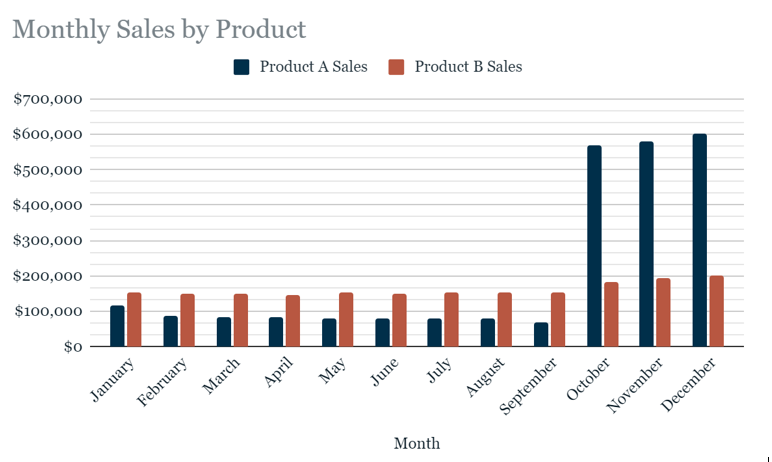
As one of the practice exercises in my course, I was given data in a table about sales for two different products. The fictional company wanted to know how to allocate their marketing dollars for the new year. The goal was to make simple, effective graphics that highlighted sales insights for the company. This first chart I made is a basic but effective bar chart. Monthly sales per product compared to each other. It was a great way to summarize everything about the data in one visualization, and it might even be enough on its own to answer the company’s questions about such a small, focused dataset.
But I wanted to practice!
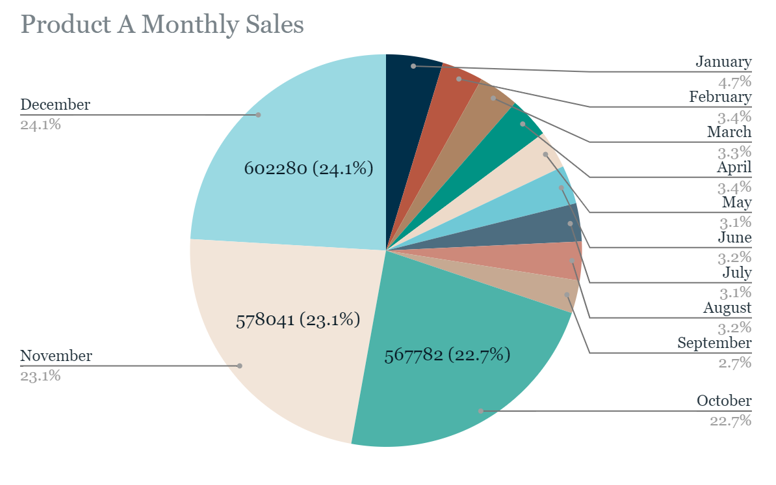
So next I made a pie chart that shows the percentage of sales for Product A that occurs in a given month as a segment of the total sales. This chart makes an insight about Product A really pop. Nearly 70% of annual sales occur in three months: October, November, and December. Sales then drop down to low levels for the rest of the year. The chart is a little busy on the right side though. Typically pie charts work best with less than 7 segments according to my course advice, so I am looking into what else could be done to represent percentages of the whole so neatly besides just the original bar chart.
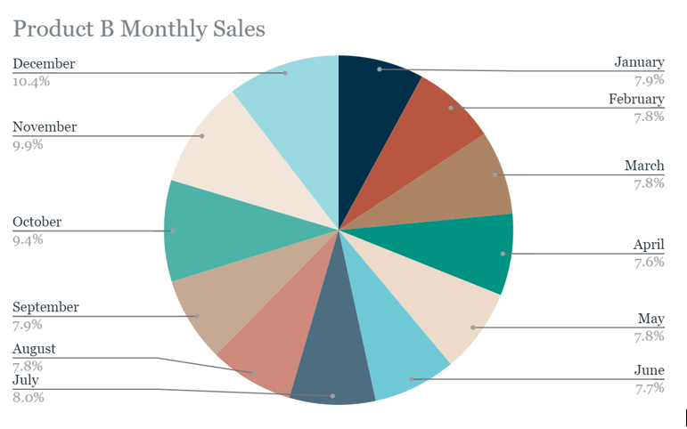
Next I tried to give Product B a similar chart...
It is a pretty image, but it’s rather busy and doesn’t communicate clearly. Again, too many segments can make pie charts less effective. So I went back to the drawing board and made one more.
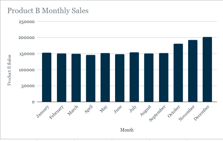
This bar chart makes it very clear that sales for Product B are fairly even year-round, with a slight uptick in the fourth quarter. The information is technically visible in the first bar chart, but pulling the Product B info out to stand on its own the same way we did with Product A was good practice. I'm excited to see what else I can create as I improve my skills with Data Viz platforms!
One big distinction between data these days is small data vs big data. These two types of data each have their PROs and CONs, so it’s important to understand the attributes, challenges, and benefits of each.
Small data is specific, focused in on a particular set of values or a shorter time period. It is usually analyzed in spreadsheets like Google Sheets and Excel with built-in tools. Small data is more likely to be utilized by small and midsize businesses. It is usually simple to collect, store, manage, sort, and visually represent due to the reasonable volume of data.
This means that small data can be processed and analyzed more quickly, allowing for swift real-time insights. It is more easily understood, interpreted, and managed directly by human beings.
The downside to this ease and speed is that small data with specific, focused datasets is not as comprehensive in its insights. The scope is often limited leading to a lack of precision. Issues with potential bias due to smaller sampling sizes can also arise.
Big data on the other hand is large and less specific. It can involve many related tables of data over longer time periods. For this reason, it is kept in databases which are queried by programming languages, rather than directly manipulated in a spreadsheet. Big data is more likely to be utilized by large businesses and organizations. Big data often needs to be broken down in order to be organized and analyzed effectively. It takes a lot of effort to collect, store, manage, sort, and visually represent big data due to its overwhelming volume.
Honestly, that last attribute forms the foundation of why big data can be so challenging. There is often way too much irrelevant, unimportant detail to wade through. Finding the tiny nuggets of relevant, important data can feel like panning for gold. These nuggets are harder to find and use. This means that analyzing big data is a slower process, leading to less efficient time frames for decision-making compared to the turnaround on small data. Even with all the amazing analysis tools we have access to these days, it can still be a struggle to provide meaningful results in a useful timeframe. There can also be some issues with unfair algorithmic bias as even our tools can require shortcuts to wade through the ever-increasing volumes of available big data.
Big data still has a lot of benefits, however, particularly in business settings. The large volume of data can help businesses identify more efficient ways of doing business, saving a lot of time and money. Big data helps spot more comprehensive trends like customer buying patterns and satisfaction levels. These things lead to a much better understanding of current market trends.
Overall, both small data and big data are useful in their own unique ways. They simply need to be utilized correctly, with the right tools and awareness in appropriate situations. If you leverage their benefits while being sensitive to their challenges you can garner meaningful insights for your projects with either one.


So how do I analyze some data...?
6/01/2024
One of the most foundational aspects of the course I'm taking is the concept of phases of data analysis. This concept is so pivotal it is used to inform the actual overall structure of the course itself. My course follows the six-phase format. Although there are variations with slightly different numbers of phases, the core concepts are pretty much universal to all versions. These six phases in order are: ASK, PREPARE, PROCESS, ANALYZE, SHARE, and ACT. Each of these stages gets its own section in the overall course.
ASK refers to the stage of analysis where you are working to understand the challenge to be solved or questions to be answered with your project. Now you can definitely fill a book with advice on each of these phases, so this is just an overview of some useful concepts about asking the right questions for data analysis. The first concept is structured thinking: a process of thinking that recognizes the current problem, organizes available info, reveals gaps and opportunities, and identifies your options to resolve the problem. Another way of looking at the ASK phase involves these steps:
- Define the problem
- Make sure you fully understand stakeholders' expectations
- Focus on the problem and avoid any distractions
- keep an open line of communication to collaborate with stakeholders
- Look at the big picture, the whole situation in context
Then you can ask yourself:
- What are my stakeholders saying their problems are?
- Now that I’ve identified the problems, how can I help the stakeholders resolve their questions?
The answer to this is by asking SMART questions.
Specific- significant, simple, single topic or few closely related ideas
Measurable- quantifiable
Action-oriented- encourage progress or change
Relevant- significant, important
Time-bound- about a specific period of time
Using these tools to help you structure your thinking around problems and formulate strong questions will help you ASK the right questions to get your data analysis projects off the ground.
PREPARE refers to the stage where you decide what data you need to collect to answer questions and organize your data in the most useful way. Questions you might ask yourself are:
1) What do I need in order to figure out how to solve this problem?
2) What research do I need to do?
Some things you will look at are:
- What metrics to measure
- What format or type of data is necessary
- Where to locate the data you need (or how to generate it)
- Chose the data source (first-party, second-party, or third-party)
- How the data will be collected and how much to collect
- Determine timeframe needed to address the problem
- Decide what data to use
- How to analyze your data for bias and credibility
- What security measures you will use on the data for security and privacy
I am going to expand on some of these aspects of data preparation here. I already talked a little about data itself in the last post like quantitative vs qualitative data. There are way too many other types, subtypes, and aspects of data that could be discussed, but there are a few I will address here.
The first is the source of your data and why it matters. First-party data is data collected by an entity using its own resources and it is typically the easiest to use and most reliable. Second-party data is data collected directly by an entity from its audience and then sold. Second-party data still tends to be pretty reliable but has a higher cost than first-party data. Finally, third-party data is data from outside sources that did not collect it directly. This type of data is the most unreliable, and special caution should be used to verify its credibility and accuracy before utilizing it.
Another aspect of data that deserves special mention here is data reliability. The acronym used in my Google course for this general consideration of credibility is:
Reliable- data that is not obviously inaccurate, incomplete, biased
Original- does not rely on 2nd and 3rd party reports
Comprehensive- not missing important info
Current- relevant and up to date
Cited- properly cited for accountability
Data like this ROCCCS and is good data for analysis. Other essential aspects to consider at this stage are how data privacy can be respected, and data security achieved. It isn’t enough to find the data, you must protect it and the people it represents with good data management. All these things and more are addressed at the PREPARE stage.
PROCESS refers to the stage dedicated to cleaning and formatting your data because clean data is the best data. At this stage, you get rid of possible errors, inaccuracies, or inconsistencies:
- Using spreadsheet functions to find incorrect data in your spreadsheets
- Using SQL functions to check for issues in your databases
- Checking as much as possible for bias in the data
Key questions you are asking in this phase are:
1) What data errors or inaccuracies might get in the way of getting the best possible answer to my problem?
2) How can I clean my data so the info I have is more consistent?
Cleaning is a process that is unique to each dataset, but there are some common issues that you can look out for. There are also some best practices for documentation in cleaning to be aware of as well. The most common things to look for are:
- Null data, or blank fields. These can really mess up your analysis, so it is important to identify these and either update them with correct information or remove them from your dataset.
- Misspelled words can affect your analysis in a lot of ways. Best to identify and fix at the beginning.
- Mistyped numbers are also a big issue best fixed before they can clog up your analysis.
- Extra spaces and characters can cause a surprising amount of mischief, so watch out for those too.
- Duplicate entries are always best identified and removed because they can skew data results.
- Messy, mismatched, or misleading items need to be adjusted. These are some possibilities:
- Data types
- Strings
- Date formats
- Column labels
- Check for truncated or missing data that needs to be investigated.
- And finally, did you check that the data even makes sense based on your knowledge of the topic?
There are amazing tools to help you accomplish all these cleaning tasks built into most spreadsheet programs like Google Sheets and Excel. These processes can also be performed on databases through SQL queries. My final note on this phase has to do with documentation. When you are cleaning data it’s a best practice to keep a changelog which is a document that keeps track of the changes you made, when you made them, and why. Such logs can be crucial when you need to go back and understand these changes, revert to previous versions of the data, and work in collaboration with others who may need to understand these changes. This is just a taste of the PROCESS stage for ensuring any data you use is clean and reliable for analysis.
ANALYZE is the phase we’ve all been waiting for. I’ve ASKED the right questions to make sure my project is focused and relevant. I’ve PREPARED my data by assessing what kind of data ROCCCs, and deciding how to manage and secure it. I’ve PROCESSED the dataset to make sure I’m working with clean, well-formatted data that is ready to go. Here is where I actually:
- Think analytically about the data
- Perform calculations
- Combine data from multiple sources
- Create tables with results
Here is where we answer the questions:
1) What story is my data telling me?
2) How will my data help me solve this problem?
You may do this with formulas, functions, and pivot tables in spreadsheets or with query languages like SQL in larger databases. Either way, this is where you get to really explore the data for insights, answers, and results. So ANALYZE that data!
SHARE refers to the phase where you present your findings. You’ve made it. You did your analysis, and you have insights to communicate. At this stage, you are ready to:
- Summarize results with clear and enticing visuals of analysis
- Use data visualization tools like graphs or dashboards
- Show stakeholders you have solved their problems and how you got there.
- Successfully communicate findings that will help shareholders
- Make better decisions
- Make more informed decisions
- Produce stronger outcomes
Key questions to answer at this phase are:
1) How can I make what I present to the stakeholders engaging and easy to understand?
2) What would help me understand this if I was the listener?
Here is your time to shine. All that work and perseverance adds up to this chance to SHARE your insights with the shareholders.
ACT refers to the final phase where you’re ready to act on your data. This stage takes the insights you have learned and puts them to use. Take any feedback from the SHARE phase and provide stakeholders with recommendations based on your findings. Ask yourself:
1) How can I use the feedback I received during the share phase to fully meet the stakeholders’ needs and expectations?
In this phase, you give your final recommendation based on your analysis of how the shareholders can ACT to resolve their stated problems from the very beginning of the project.
Like I said, I’m sure there could be books written about each phase and the tools used in each one. But this is a summary of the overall process and some of the interesting aspects and tools I learned about so far in my Adventures in Analysis. Stay tuned as I continue to climb!

Data, data everywhere
5/26/2024
It's not like I was oblivious before. Of course we use data to help make decisions! What else are facts for? But honestly, I never really stopped to think about the sheer amount of data being produced these days in our hyper-digital age. Everything I do leaves a footprint of data somewhere. Did I open a website? Search for an item I need? Look up a restaurant I want to go to? Odds are I left data behind me, and it all adds up.
Besides the data I generate, I also never truly stopped to think about how many things I use on a daily basis are built on data. Do I want to check the temperature on my weather app when I get up in the morning so I dress for the weather? Do I want to check the nutrition facts on my cereal box as I eat my breakfast? Do I want to pull up Google Maps and check the traffic so I can choose the best path for my morning commute? So much data went into each and every one of those platforms. And honestly, I rarely think about it.
But now, I'm thinking. My course informed me that data is the world's most valuable resource. How much could I enrich my life by learning to use it? What could I do if I learned to transform data into insights, to do analysis?
During my certification course, I have been introduced or reintroduced to important aspects of data itself. Those topics include the life cycle of data, qualitative vs quantitative data, and fairness in data analysis. Each of these topics helped me expand my understanding of data and its uses.
The Life Cycle includes the following stages: plan, capture, manage, analyze, archive, destroy.
- Plan: This stage involves identifying what kind of data is needed, how it will be managed, and who will be responsible for the data.
- Capture:This stage involves collecting and bringing in data from a variety of sources.
- Manage: This stage involves making sure data will be cared for and maintained, identifying how and where it will be stored and the tools used to do so.
- Analyze: This stage involves using the data to solve problems, make decisions, and support business goals.
- Archive: This stage involves storing relevant data for future use.
- Destroy: This stage involves removing any data from storage and deleting it and any shared copies.
The data lifecycle is described in several other systems with a varying number of stages, but the key concepts are fairly universal.
Another big topic when discussing data is whether it is qualitative or quantitative. Quantitative data, or things you can measure, usually answer questions of what, how many, how often and so on. Quantitative data is easier to mathematically manipulate and represent in charts and graphs. Common data tools to gather quantitative data are structured interviews, surveys, and polls. Qualitative data is subjective or explanatory. It measures qualities and characteristics and often answers questions about why. This can help explain why the numbers are the way that they are and provide bigger context. Common data tools to gather qualitative data are focus groups, social media text analysis, and in person interviews. Each type of data provides a different type of insight and together they can help drive great decisions.
The final topic I wanted to include in this short exploration of data is fairness. While fairness is not exactly a quality of the data itself in raw form, it is an absolutely essential aspect of anything we do with it. Promoting fairness in data analysis involves ensuring that your analysis doesn’t create or reinforce bias. Some best practices in fairness are:
- Consider all available data-no ignoring things.
- Identify surrounding factors-get that context.
- Include self-reported data-evaluate bias in your data sources.
- Use oversampling effectively-represent groups that otherwise wouldn’t be represented fairly.
- Think about fairness from the beginning of your data project to the end.
Following these practices will help promote fair and unbiased use of data. Another way of looking at data fairness evaluates any data you use according to the following questions:
- Who collected the data?
- What is the data about and what does it connect to?
- Where was it collected?
- When was it collected, is it still relevant?
- How was it collected?
- Why was it collected, with what purpose?
Knowing these things about your data can help you understand the context it exists in and evaluate or reduce any bias that is present.
So, what does this add up to? Data is everywhere. If I want to make it work for me and any future employer, I need to understand the lifecycle of data moving through our systems so that I can manage any data I use properly. I need to understand the different types of data because they are analyzed differently and answer different questions. Finally, fairness is an essential aspect of any analysis and needs to be addressed from beginning to end of every project and even included in an assessment of what data can be included as well. I can’t wait to see how understanding these aspects of data and its analysis will help me move forward in my analysis adventures.
We need your consent to load the translations
We use a third-party service to translate the website content that may collect data about your activity. Please review the details in the privacy policy and accept the service to view the translations.
